Prime Buchholz
Website Design, Print-
Prime Buchholz was established in 1988 and has grown to become a leading, completely independent investment consulting firm advising more than 250 institutional clients. They were one of the first investment consulting firms to develop in-depth expertise in alternative investments such as hedge funds, private equity, and real assets. Prime Buchholz’s clients include educational endowments, private and public foundations, cultural and faith-based organizations, health care and insurance organizations, pension plans, and high-net-worth families. Prime Buchholz was aware that their brand and, as a result, their website, looked dated and nondescript.
The goal for this project was to differentiate Prime Buchholz by better telling its story of mission-aligned investing both on the web and in its supplemental marketing materials, and to do so with a more modern, updated aesthetic.
Photography: John Benford

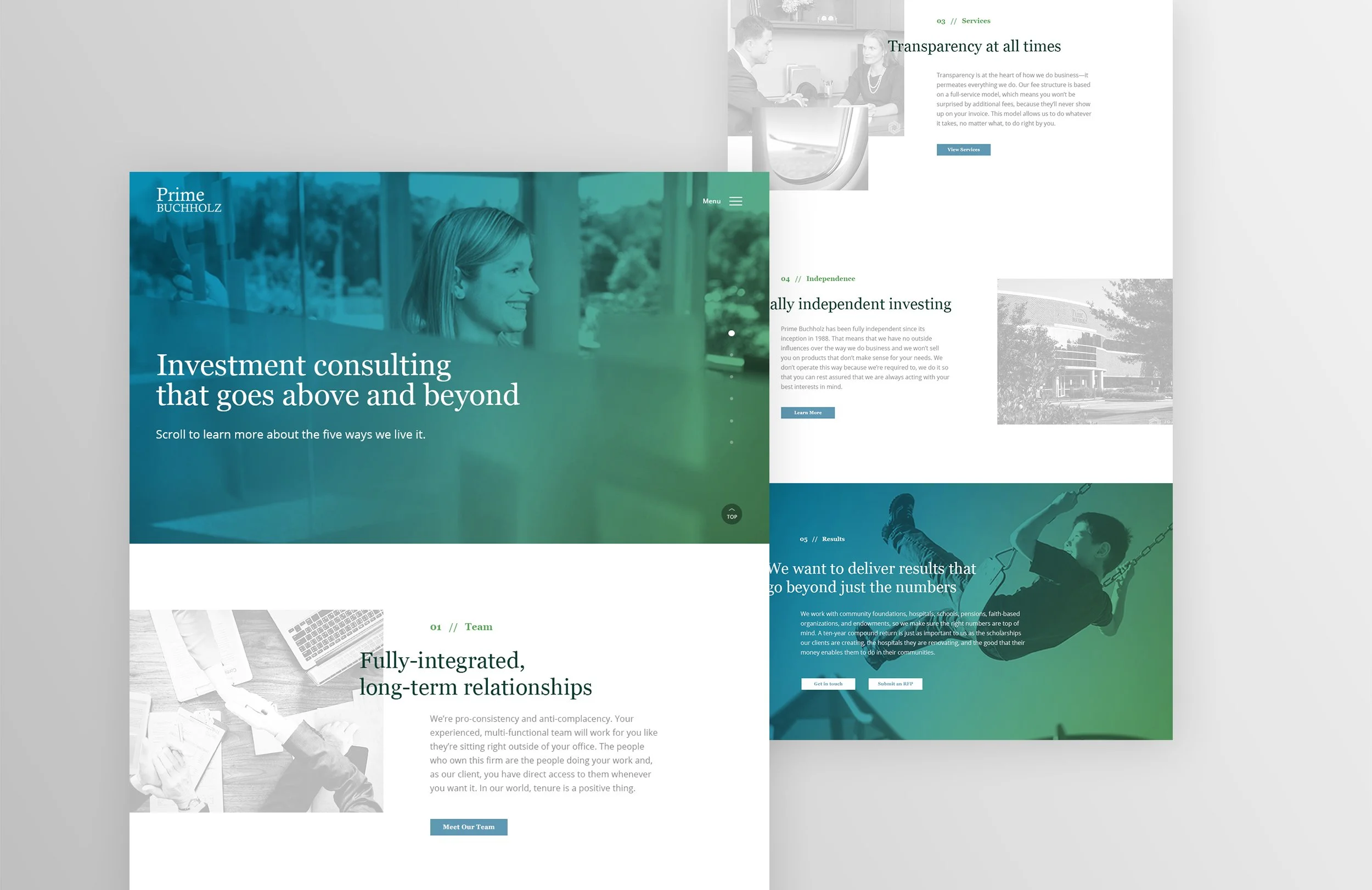
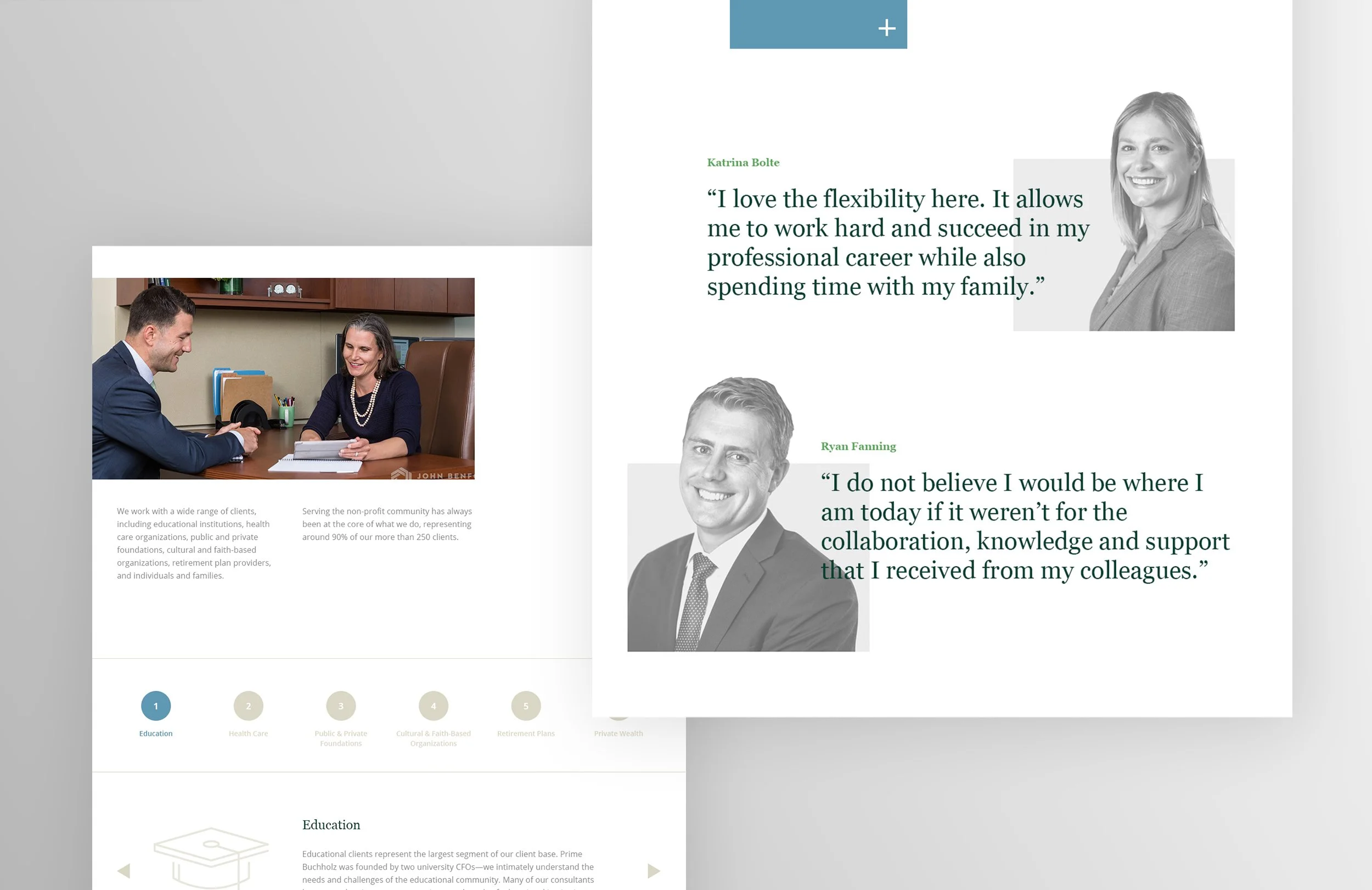


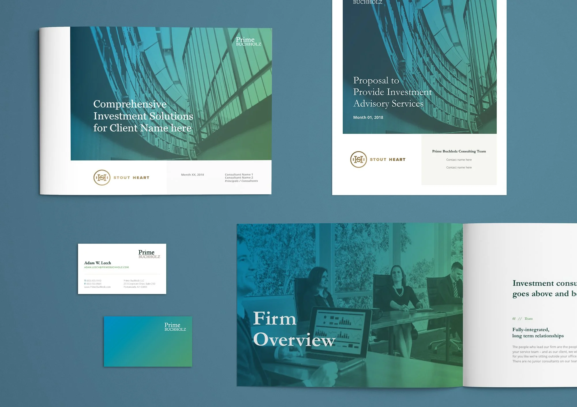
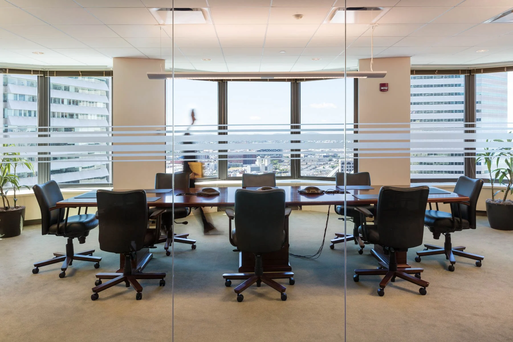
The goal for all of Prime Buchholz’s materials was to move away from the preconceptions of how banks and financial institutions visually present themselves, while maintaining some of the brand’s original equity. A brighter color palette was chosen as a stark contrast to the legal greens and browns. The brighter palette and use of gradients gives a feeling of energy and movement. The new look-and-feel also employs a generous amount of white space so that the user doesn’t feel like he or she is being bombarded by information. We also coordinated and directed a photo shoot using real employees in an effort to make the brand feel more human in a space that tends to be stuffy and unapproachable.


An extensive audit of all of Prime Buchholz’s internal and external documents was done to ensure that every touchpoint of the brand was consistent. Materials ranged from pitch books and presentation templates, to business cards and letterheads.